
Hi all,
I am a student from Swansea University and I am currently working on a data visualization assignment that involves visualzing data from Project Tycho (https://www.tycho.pitt.edu/) . After having read about the impact of the Hepatitis A vaccination post the mid 90s, I was motivated to visualize how the impact of Hepatitis A had changed per region in the United States. I will present a basic heatmap below which visualizes the number of cases of the disease per year per region from 2001-2011.
I would love to get some feedback to see if there is any way to improve this visualization. I was doubting whether grouping the states via regions was a good idea but the reasoning was to make it easier to get a quick interpretation and quick decision for where further exploration could be focused. Also as there are a large number of states which might make it less visually appealing.
I thus have a couple of questions to ask, would you recommend all the states be placed on the Y-axis instead of grouped as regions? If so, which visual layouts would be effective with dealing with the large number of states? Also, generally what would you recommend as a visual layout to more clearly show the declining impact of Hepatitis A in the US?
Last question would be, in this instance, do you think it would be more effective to report on the number of incidences per 100000 per region or to stick with the number of cases in showing this trend?
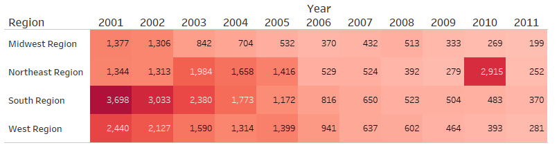
Visual Design Type: Heatmap
Name of tool: Tableau
Country: United States of America
Disease: Hepatitis A
Year: 2001-2011
Visual Mappings:
-Color: Color intensity is mapped to the number of cases of Hepatitis A in that specific region of the United States and in that specific year. A higher intensity of the color red represents a higher number of cases.
-X axis: The years from 2001-2011 are along the X-axis.
-Y axis: The four regions of the USA are along the Y-axis
Unique Observation: We can see a trend among all four regions as the number of cases generally decreases over the years. This trend could be in response to the increased vaccinations carried out in the United States. However, we can also see an outlier in 2010 where there was a spike in the number of cases in the Northeast region. This could be due to an outbreak in that region. Also in that same region between 2003-2005 there was an increase in the number of cases which could suggest that region is more prone to outbreaks.
Data Preparation: The data for Hepatitis A for the specific years of 2001-2011 was first extracted from the DOI 10.1056/NEJMms1215400. Additional column of region was added with region mapped to state using information from the United States Census Bureau (https://www2.census.gov/geo/pdfs/maps-data/maps/reference/us_regdiv.pdf ) to group the states. Additional column of Year was created extracting this information from the epi_week column.
DOI of data used from Project Tycho: 10.1056/NEJMms1215400