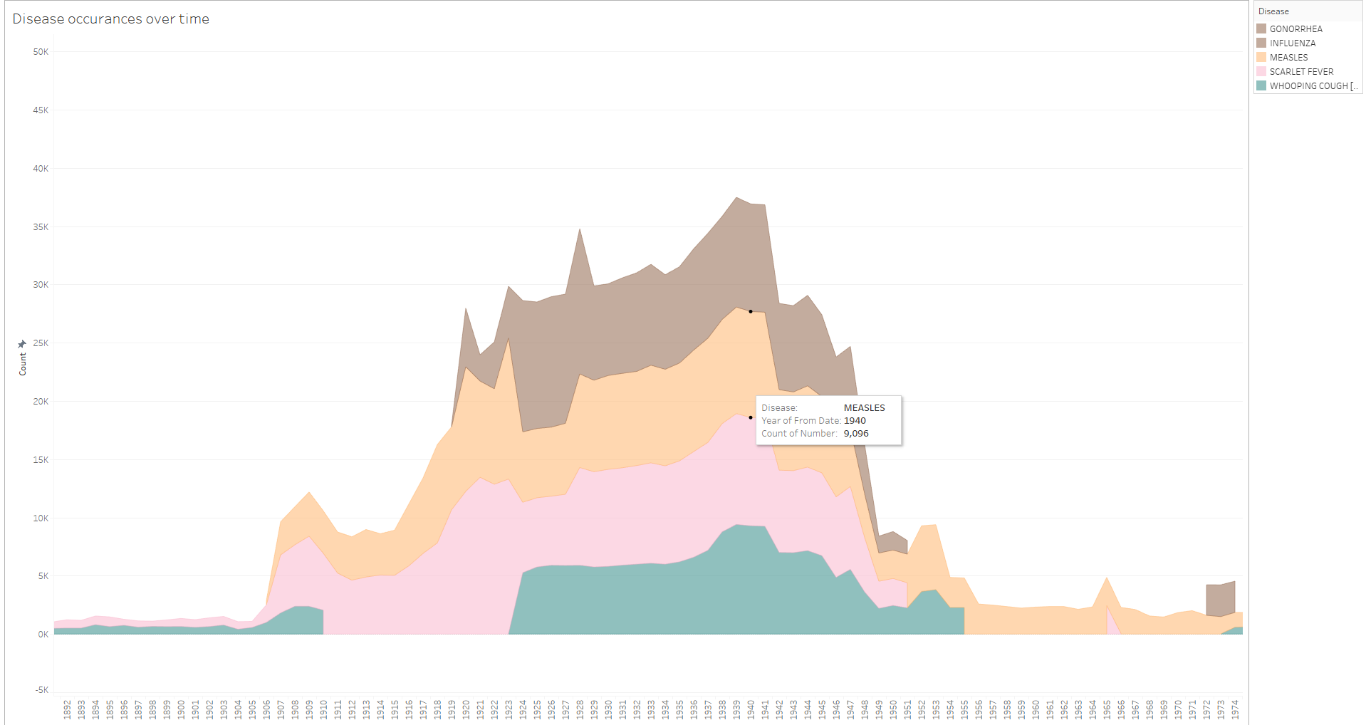
Tool: Tableau
Country: US
Diseases:
- Gonorrhoea
- Influenza
- Measles
- Scarlet Fever
- Whopping Cough
Year: 1892 - 1974
Visual Mappings:
- x-axis: Date
- y-axis: Count of disease incidents
- colour: Disease type (only top 5 shown)
Data Preparation:
- Filter the epiweek between the two year points to look specifically at the
spike in disease occurrences in early 1900s. - Aggregate the following data sets together, omitting blank or non-useful fields.
Source: Project Tycho
DOIs:
- Gonorrhoea 10.25337/T7/ptycho.v2.0/US.15628003
- Influenza 10.25337/T7/ptycho.v2.0/US.6142004
- Measles 10.25337/T7/ptycho.v2.0/US.14189004
- Scarlet Fever 10.25337/T7/ptycho.v2.0/US.30242009
- Whopping Cough 10.25337/T7/ptycho.v2.0/US.27836007
My question:
- I notice that pertussis or whopping cough has no values between 1910 and 1923 roughly, what could be the reason for that?
- Are the choice of colours particularly good? If not which colour mapping would you suggest?
- Could this visualisation be misleading? If so what could be done to limit this?