
Hi,
I am a student who has been tasked with exploring the Project Tycho data set and producing various different data visualizations to help better understand the data. Below is one of those visualizations; A map displaying the spread of malaria across the US in 1954 for the civilian and military sub-population.
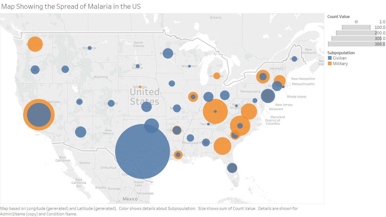
Visual Design Type: Map
Name of Tool: Tableau
Country: United States (except Alaska, Hawaii and Puerto Rico)
Disease: Malaria
Year: 1954
Visual Mappings:
Colour – Orange represents the Military subpopulation, blue represents the Civilian subpopulation.
Size – The size of the circle represents the total count of cases recorded, with each colour representing their relative sub-count
Location – The location is the US state where the case was recorded.
Unique Observation: As we can see, in 1954, Malaria was particularly focused on the coast of the US (especially the east) with very few cases recorded inland. Furthermore, with the exception of California and Washington, almost all the military cases fall in along the east-coast of the US whereas the Civilian count is far more varied.
Data Preparation: Using data query on the project tycho website, militay and civilian should be selected under subpopulation and then malaria under condition. AdminName1 was also converted to a geographical type of US states.
My question is this:
Is there a better way to visualize the difference between Military and Civilian spread of Malaria across the US, as I feel the current method which uses solid circles could be a bit difficult to observe.