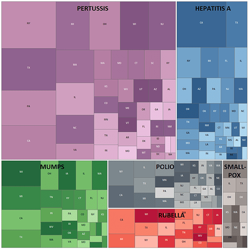
Visual Design Type: Tree Map
Name of Tool: Tableau
Country: USA
Diseases: Hepatitis A, Mumps, Pertussis, Polio, Rubella, Smallpox
Years: 1928 - 2011
DOI: https://doi.org/10.24097/wolfram.11959.data
Visual Mappings:
- Colour – Disease,
- Colour Intensity – Average number of incidences per 100k people,
- Leafe node size – Number of cases in a given state
- Internal node size – Number of cases of a given disease
- Labels – Disease name, State Abbreviation
Hierarchy: Country (USA) > Disease > State
Unique observation:
Contrary to what one might expect, the total number of disease cases doesn’t appear to be correlated with the number of occurrences per 100.000 people. This might be worth a further investigation as I have yet to find the explanation.
Data preparation: States with less than 500 cases of a certain disease have been excluded to preserve the clarity of the visualisation.
Algorithm: Squarified treemap algorithm
Resources used:
D. M. Bruls, C. Huizing, J. J. van Wijk, "Squarified treemaps.", In Joint Eurographics and IEEE TCVG Symposium on Visualiz
ation , pp. 33-42, 1999.
https://datavizcatalogue.com/methods/treemap.html
Questions:
Is the hierarchy of my treemap correct?
How should I deal with the nodes too small to include a label on them?
Is filtering out the small part of the dataset as I did, in this case, a good approach? (Filtered out stated with less then 100 cases of a given disease)

