
Hi, Swansea student here.
I’ve attempted to visualise the affect conflict has on the spread of Dengue virus within the Philippines. The idea going into this was to determine if “stability” as measured by instances of conflict violence would have a notable affect on dengue infection rates. The theory being that low stability regions tend to deal with infections worse. The visualisation takes place between 2000 to 2010.
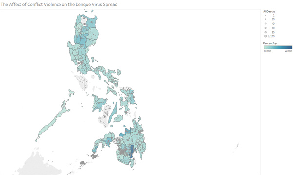
The above design shows the percent of a regions population that were infected by the dengue virus over 10 years. The greater the saturation, the higher the percentage (between 0 and 4%, nowhere went higher than 3.5%). Overlayed onto this are instances of conflict violence as recorded by the UCDP data set, these use a longitudinal and latitudinal co-ordinate to plot the number of deaths that resulted from any given event in the data set. Size being encoded to the number of total casualties caused by the event.
Tool: Tableau
Data sources:
dengue virus data for the phillipines from project tycho https://www.tycho.pitt.edu/data/
conflict data from the upscalla data conflict program https://ucdp.uu.se/#country/840
Phillipines population information from the Phillipine statistic authority https://psa.gov.ph/products-and-services/publications/philippine-statistical-yearbook
Data preparation:
Aside from removing all the unnecessary fields within all 3 data sets, aliases were added for all the Philippines information on Tycho and the PSA in order for them to co-operate with Tableau. The PSA lists population by region, but in many instances included cities as a separate entry, which then had to manually be re-added to region totals. Average population is a created field from 2 different census’. This is used to determine the “percent of region population afflicted by dengue” with the project tycho data.
Visual Mappings:
- Colour : Percent of region pop afflicted by dengue
- Position: long and lat co-ordinates to plot conflict instances.
- Size/Shape : Circle size of conflict instance determining casualties caused by the event.
As you can pretty much see from the data, there doesn’t appear to be much affect on dengue from the concentration in violence. The southern regions have more occurrences but no real change in dengue rates. Meaning either the Filipino government effectively limits the affect conflict has within a region, or that other factors influence enough to eclipse any change from the “stability”. For example, the northern regions tend to be more affected by extreme weather/monsoons. Or the visualisation is poorly thought out.
It does still however show that as a population percent, dengue is fairly uniform across the Philippines.
Questions:
Are any parts of my visualisation unclear?
Is there a better way to visualise the “stability” beyond the simple incident plots?
Is the colour mapping effective?
Is there a way to aggregate plots that lie within one another, or at least make the circles translucent? (couldn’t find this myself)
Suggestions on better use of time frames? Selected 10 years to get a broad coverage, but this does mean artificially averaging a lot of the data.
Most importantly: Is the visualisation worthwhile in that there isn’t any overt correlation? My rational on this is saying that the assumption would be there is correlation (destabilised regions do fare worse with epidemics historically), so showing there isn’t is still useful. Either pointing to changes in how conflict affects a region, or the ability of the Philippines to absorb it.
Any and all feedback appreciated.