
Guideline: • Visual Design Type: Heat maps
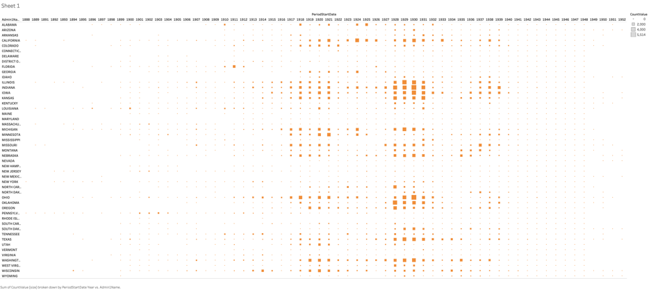
• Name of Tool: Tableau
• Country: U.S.
• Disease: Smallpox
• Year: 1888 - 1952
• Visual Mappings:
– size : size is mapped to the size of CountValue, which is the number of people. suffering from smallpox
– position : X axis represents different years, while Y axis shows different states of U.S.
• Unique Observation: From this visualization , we can see that figures of patients in 1917 – 1939 accounts for the largest proportion, we can hardly see any report about smallpox after these years.
• Data Preparation: we need to know the figures of each state for each year, so three attributes are used to represent the situation while the size of rectangles refers to figures of patients
Source: data from Project Tycho (https://www.tycho.pitt.edu/)
doi: 10.25337/T7/ptycho.v2.0/US.67924001
Question:
Does my heatmaps make it clear to see the real situation of the infection of smallpox?