
Good Afternoon,
I am a student from Swansea University and I am currently working on a data visualization assignment that involves visualizing data from Project Tycho(https://www.tycho.pitt.edu/). As part of the assignment I have been asked to pose a question about one of my visualizations onto VisGuides.
Here I wanted to look at number of incidents of MMR in the US in order to find out if there is anything of interest that can be concluded from the visualizaiton of this data. I present a choropleth image.
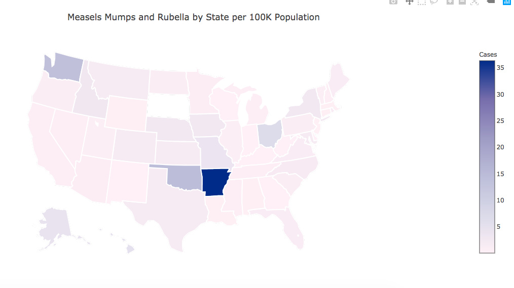
Visual Design Type: Choropleth
Name of Tool: Plot-ly. Cited //plot.ly/python/county-choropleth/
Country: US by state
Disease: MMR
Year: 1998 - current
Visual Mappings:
color: color intensity is mapped to number of cases per 100,000 population per state. Higher the intensity the more cases
position: data is mapped to states in the US
Unique Observation: Arkansas has darkest color indicated highest number of cases per 100k population. An internet search highlighted a recent outbreak in the state. From (www-cdc.gov-mumps-outbreaks), a large (*Mumps) outbreak in a close-knit community in northwest Arkansas, resulted in nearly 3,000 cases."
Data Preparation: Data comes from Project Tycho. Data was compiled by selecting number of cases of measles, mumps and rubella per US state between 1998 and current date. Data DOI(s) (10.25337/T7/ptycho.v2.0/US.14189004//
10.25337/T7/ptycho.v2.0/US.36989005//
10.25337/T7/ptycho.v2.0/US.36653000)
The original data was filtered down to state, total counts of Measles, Mumps and Rubella were summed per state, in addition population of each state was included as of 2012. Source (datamarket-com/data/set/4m86/us-population-by-state-and-county#!ds=4m86!7x53=7:7x52=2.3.4.5.6.7.8.9.a.b.c.d.e.f.g.h.i.j.k.l.m.n.o.p.q.r.s.t.u.v.w.x.y.z.10.11.12.13.14.1h.15.16.17.18.19.1a.1b.1c.1d.1e.1f.1g:8sf4=1&display=barstack
My question:
In the visualization you can see that Arkansas is darkest colouring indicating highest number of cases of MMR. The issue is that this appears to skew the image in that other states are appearing much lighter. So it is difficult to see any trends that may appear between these other states. What is the best way of dealing with this outlier? In addition are there any improvements that can be made to this visualization?
Many thanks C
*** I had to unlink some URLs as new users are only allowed to add two to a post!?