Area Chart Labels

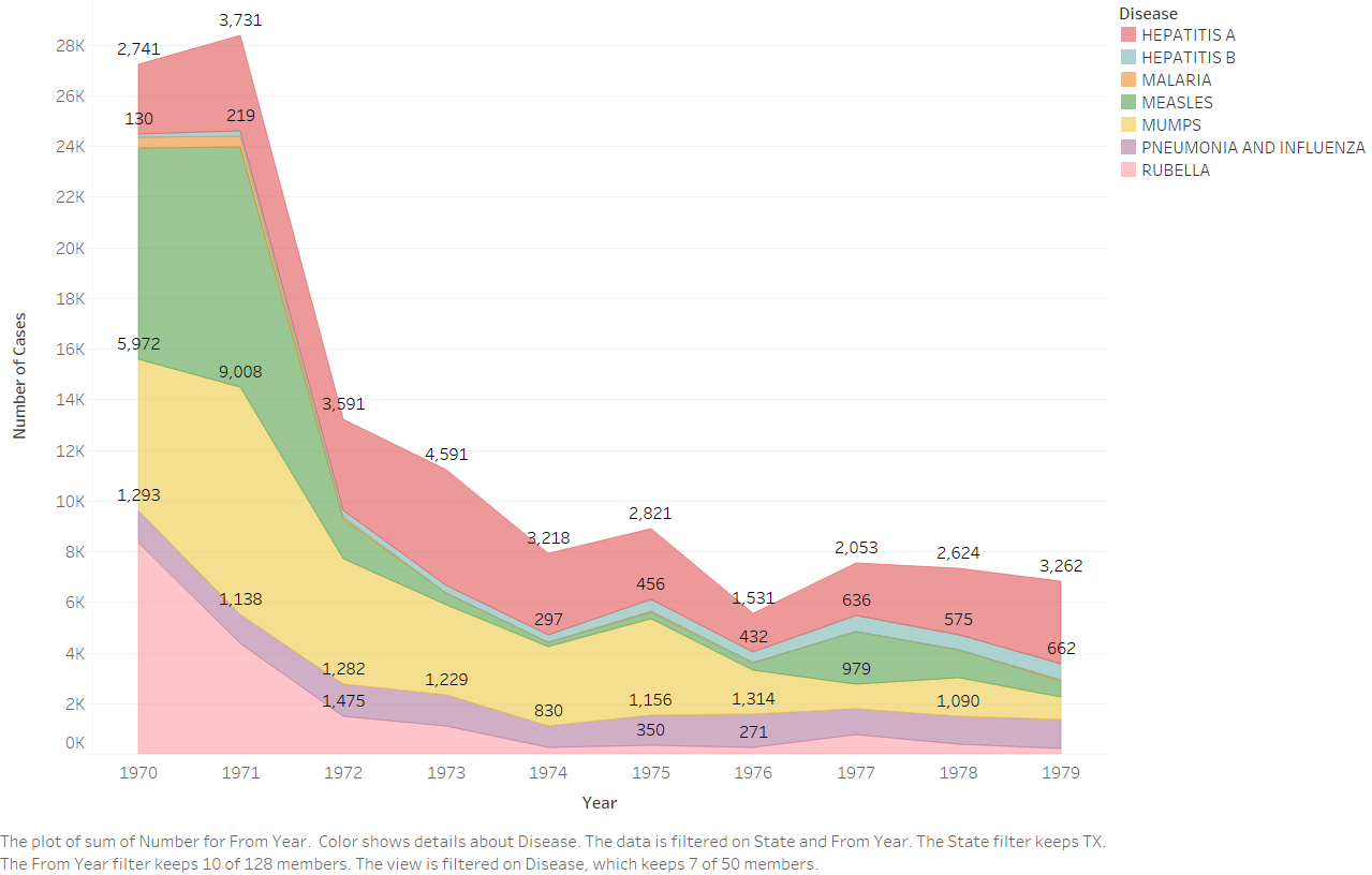
I have created an area chart using Tabeau for my Data Visualization class, and it shows the number of cases of 7 different types of diseases in Texas in the 1970’s. Each disease is represented by a different color in the chart and each point indicates the number of accumulated disease occurrences up to that point during the designated year. The data comes from Project Tycho and I selected these diseases by narrowing down the data to only diseases that have recorded cases throughout the 1970’s in Texas.
(Citation: Willem G. van Panhuis, John Grefenstette, Su Yon Jung, Nian Shong Chok, Anne Cross, Heather Eng, Bruce Y Lee, Vladimir Zadorozhny, Shawn Brown, Derek Cummings, Donald S. Burke. Contagious Diseases in the United States from 1888 to the present. NEJM 2013; 369(22): 2152-2158.)

My question is, how should the chart be labeled? I thought showing the height, or number of disease cases, at each point would be a good way to help communicate the data, but because of spacing it is only possible to show some of the points. Without the labels, though, I think the values can still be easily determined, but the chart looks very plain. There’s a picture of the chart with the limited points labeled below.

Texas2

Thank you!
Hannah

Hi 995023,

I think your solution works fine. Labeling all points would be too cluttered anyway. Part of the reason for using a line chart is that low-level look-up tasks are supported rather well.

However, there is one big issue with that chart and the numbers. Your numbers indicate numbers per disease (color). However, using a stacked area chart, you’re implying added values. Personally, I find that confusing but a possible solution could be:

  • add a title to the chart saying that these are values by disease,
  • add the added values as bold / italic values for each time point.

One other specific suggestion, to further improve value look-up, would be to work on the visual design of the scale and the grid lines. For example, make the grid lines a little more salient, just a bit! Then, highlight specific gridlines, e.g., those for 10k, 20k, even more. You can repeat that for those of 5k, 15k, and 25k if you like. But less than for 10k and 20k. You can even switch to dashed lines or use different line widths to achieve your goal of balancing grid line saliency.

I doubt that would work in Tableau, but you might be able to export the chart and go with illustrator, e.g…

does that help?
cheers,
ben